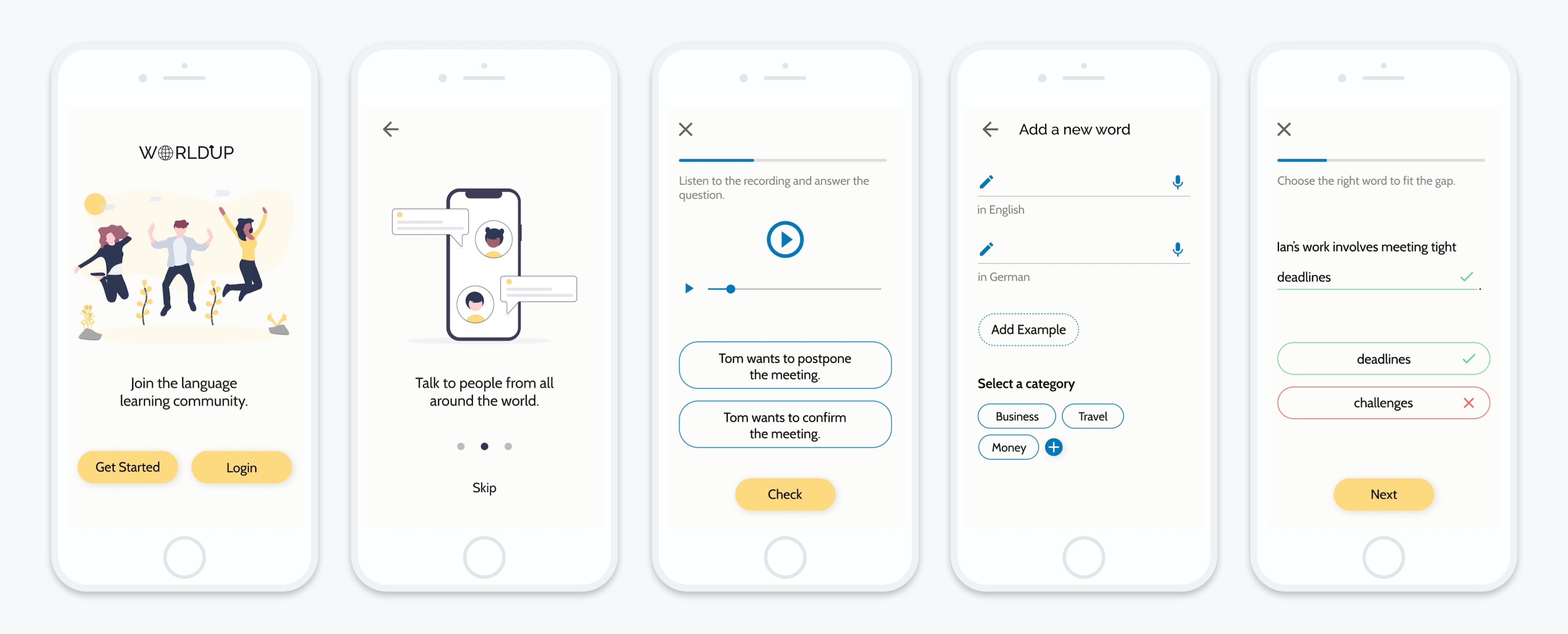
The Challenge
How might we design an app that empowers people to learn new vocabulary?
Learning vocabulary with apps can be repetitive and boring when words are too easy and learned on their own. It's also easy to forget new words when not applied regularly. Moreover, it can be hard to know if you pronounce words or use them correctly without human feedback.
Worldup solves the problem by providing a way for language learners to learn words in everyday context they are used. It also connects them to native speakers and peers from across the globe to practice what they learned, test their knowledge, and memorize vocabulary better.
Process
Design Thinking
To solve the problem, I applied the design thinking methodology during the project. It was used to understand the user, define the problem, and create a user-centered solution in six phases.

Understand
Competitive Analysis
I started off by conducting a competitive analysis of 3 apps to understand the problem space. For the analysis, I chose Memorion, Lexilize Flashcards, and Quizlet. After analyzing their launch experience, navigation, and ease of task completion, I was able to assess their strengths, weaknesses, and identify opportunities to position my app in the market.

Opportunities for Worldup
- Short onboarding process to explain the benefits and value of the app to familiarize users with the app's features.
- Progress through exercises without interruptions.
- Consistent UI throughout the app.
- Create an engaging experience to learn new vocabulary by swipe gestures and categorizing words in contexts.
- Provide a way for users to indicate their level of experience in learning vocabulary.
Observe
User Interviews
Next, I conducted 4 user interviews (2 in-person, 2 remotely) to identify user needs and goals. Recruitment of participants was done by pitching my project in an English class at a local adult education center, asking random students at university, and via Slack. Participants were between 20-49 years old and were screened for recent experience in learning a new language with apps.
The goal of the interviews was to find out:
- How people approach learning vocabulary
- What methods they use
- What experience they have with learning vocabulary with apps
After the transcription of the interviews, I organized my data into three categories (thinking, feeling, doing) for an analysis of user behaviors, thoughts, and feelings. The key results of the synthesis are listed below.
Key Findings
- Users learn vocabulary for work, vacations, or to learn about new cultures. They learn new languages because they want to advance in their careers or to speak fluently with native speakers on vacations.
- Vocabulary is learned through repetition. Writing words down, reading them out loud, and recalling them is often the preferred method for memorizing new words. Users also learn best through a combination of methods like typing, listening, and speaking.
- Users need to learn words in contexts and apply them to everyday life to make them stick. Learning words in categories or sentences helps them to memorize words better, so they can use them in daily contexts to express themselves confidently and freely.
- Users need interactions with others and apply what they learned in conversations. Human interaction with native speakers is an important way to test how good their knowledge is, but many apps lack the option to talk to native speakers directly.
- Vocabulary apps like Babbel or Busuu are too easy for users. They get frustrated when they learn words they already know and feel like there's nothing new. They want to learn intermediate and advanced words based on their skill level to get a sense of accomplishment.
POV
Empathizing with the User
In order to empathize with the user, I used my research findings to create a proto-persona called Francesca Mancini. As a reference throughout the project, the persona helped me to make design decisions with end-users in mind.
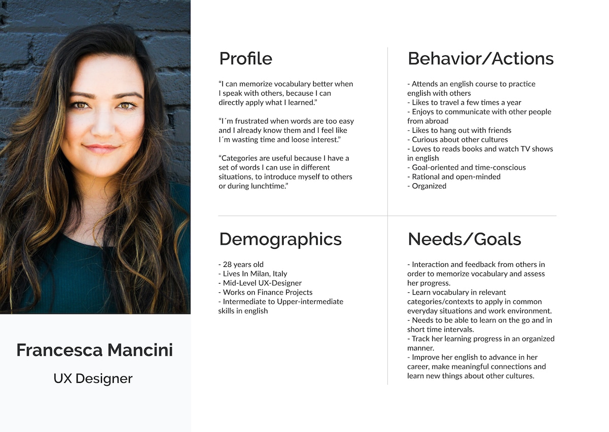
User Stories & Job Stories
Next, the proto-persona was used to create user and job stories to understand what Francesca wants to accomplish in what context. These were important to define functions and solutions for my app from a human perspective.
User Stories
- As a language learner, I want to learn vocabulary in contexts like categories, so that I can use these words in daily situations and express myself freely and confidently in English.
- As a social person, I want to talk to others in English, so that I can directly apply my vocabulary in conversations and get instant feedback on what I need to improve.
- As a curious person, I want to learn advanced words I don't know yet, so I can expand my vocabulary and make progress in learning English.
Job Stories
- When I'm on my break at work, I want to quickly learn business vocabulary in short exercises, so I can apply words later that day in meetings with international clients.
- When I read books or watch TV, I want to pull out my phone and add vocabulary I encounter to my app so I can study these words later.
- When I'm on my commute from home from work, I want to take a short playful quiz in English vocabulary, so I can have some fun learning vocabulary and distract myself a bit from work.
After I gained enough clarity through user research, the proto-persona, and the user/job stories, I could define the problem and propose a potential solution.
Problem Statement
Francesca Mancini needs a way to learn vocabulary by interacting with others and learning advanced words in relevant contexts because she wants to advance in her career, apply her knowledge to everyday situations, and assess her progress by getting instant feedback from others.
Hypothesis Statement
We believe that by creating a vocabulary app as a supportive social platform, where language learners can call and chat with native speakers and other students to improve their language skills, and by providing a feature to learn new words in relevant contexts via categories, for Francesca Mancini, we will achieve an increase in language fluency and help Francesca make faster progress in learning English.
Ideate
Task Analysis and User Flows
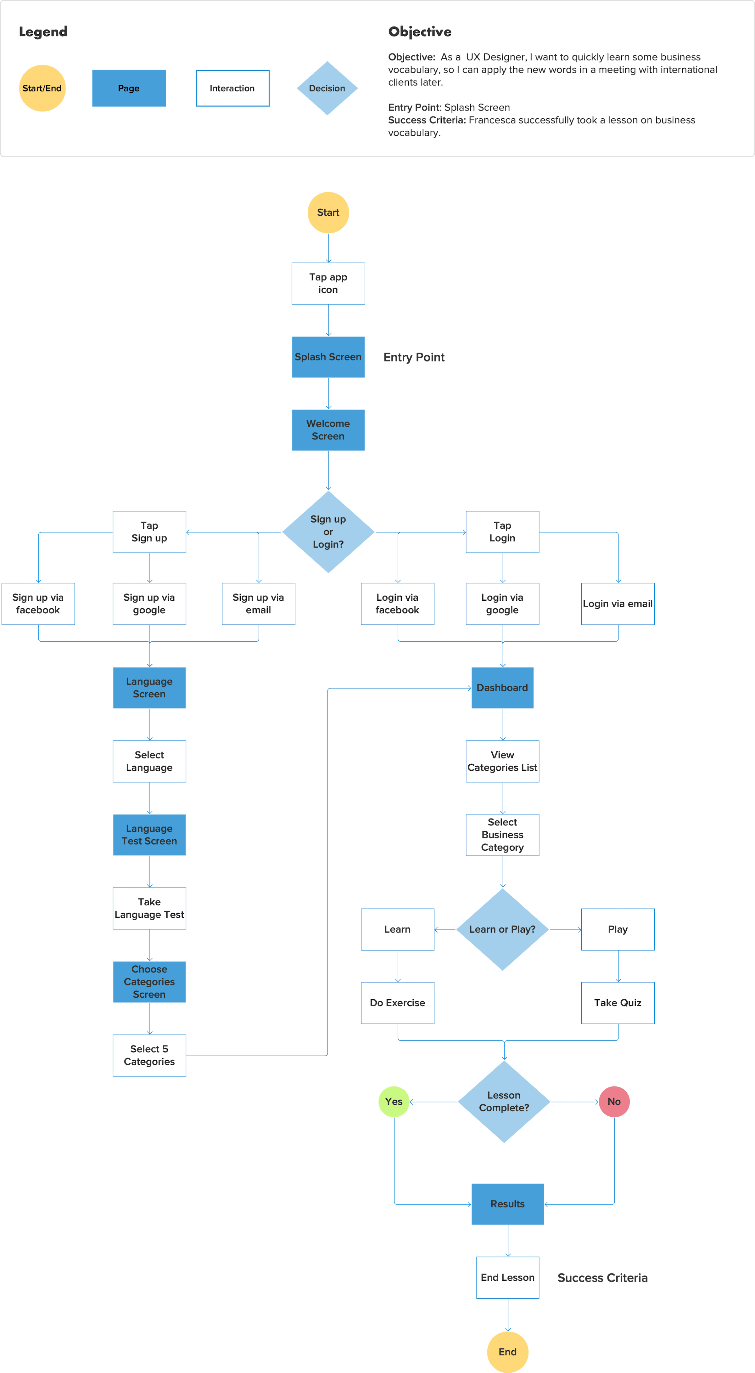
To understand how users will navigate the app to complete their main tasks, I performed a task analysis and mapped out user flows. The analysis was used to identify key tasks Francesca would need to do in what order. Based on my results, I created user flows for 2 main tasks to visualize the paths Francesca would take to accomplish her goal in the app.
User Flow: Take a lesson on business vocabulary
Prototype
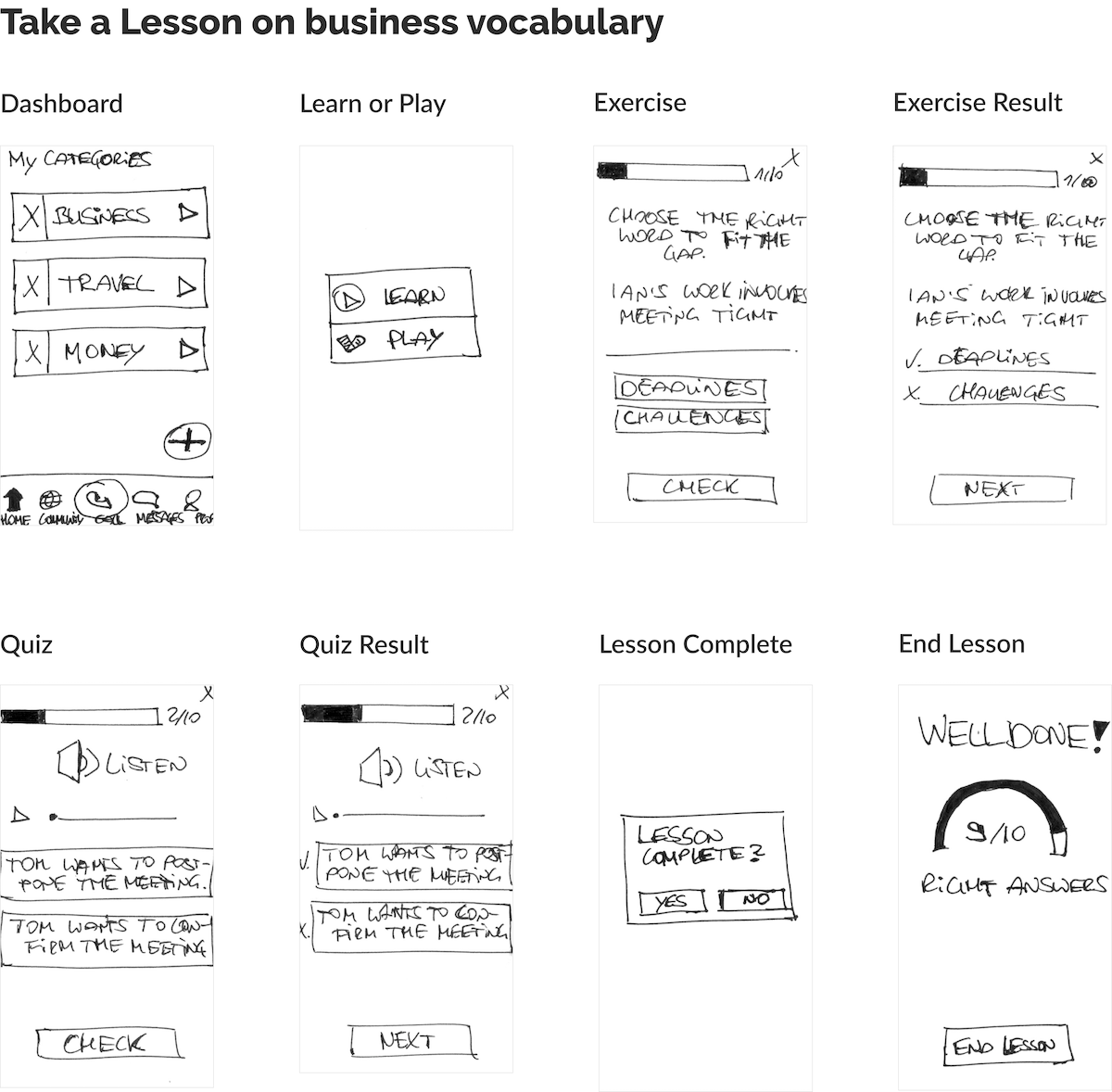
Sketching out possible solutions
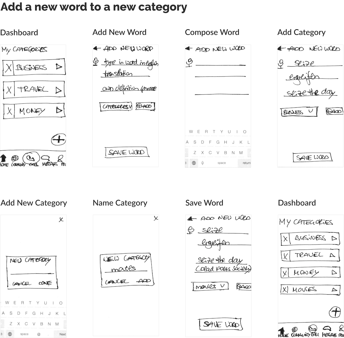
Next, user flows were used to inform the prototype phase. To come up with different solutions to the problem, I used rapid prototyping and the crazy-8 technique. At first, I created low-fidelity wireframes on paper and then turned them into a prototype using Prott to validate my solution in the next phase with real users.
Test
Usability Testing
To put the prototype to the test, I conducted moderated remote usability tests with 4 participants via Skype. The goal was to test the sign-up process and how easily basic functions, such as adding new vocabulary to categories or taking a lesson on business vocabulary, can be completed. The findings were summarized in a short test report. Afterwards, the prototype was revised based on user feedback.
Test Results
Although participants could sign up to the app quickly and easily, they had severe difficulties with the other tasks. The errors and challenges experienced are listed below.
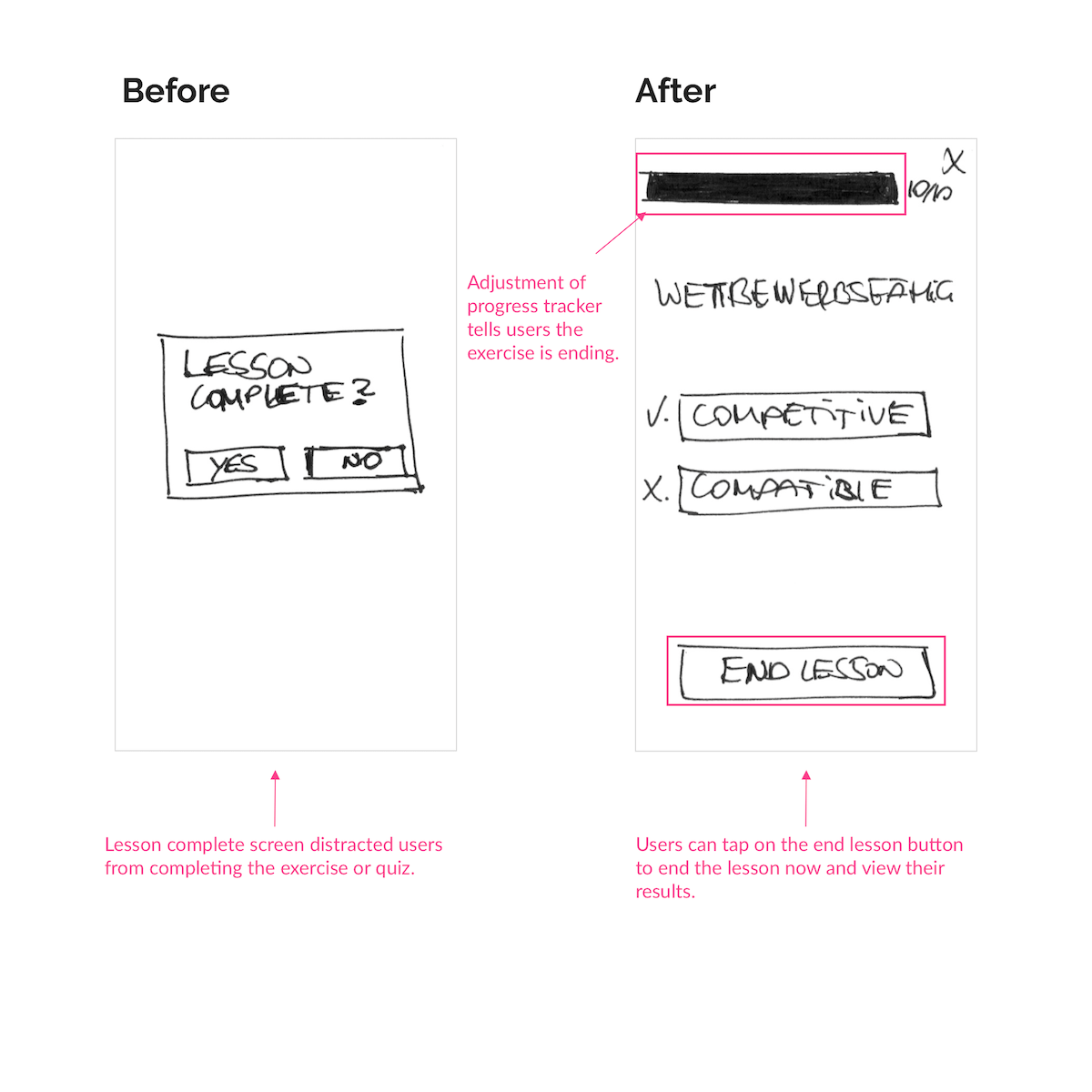
Issue 1: Lesson complete screen (Severity: 3)
3/4 participants found the lesson complete screen distracting to be displayed in the middle of the exercise because they wanted to move on with the exercise and not be interrupted to be asked if the lesson was complete or not.
As a result, I removed the lesson complete screen and adjusted the progress bar for users to see that their exercise is ending instead. Additionally, I added an “end lesson” button at the end of each exercise and quiz block, so users could focus on completing the exercise and know when it's over.
Issue 2: Add a new word screen (Severity: 4)
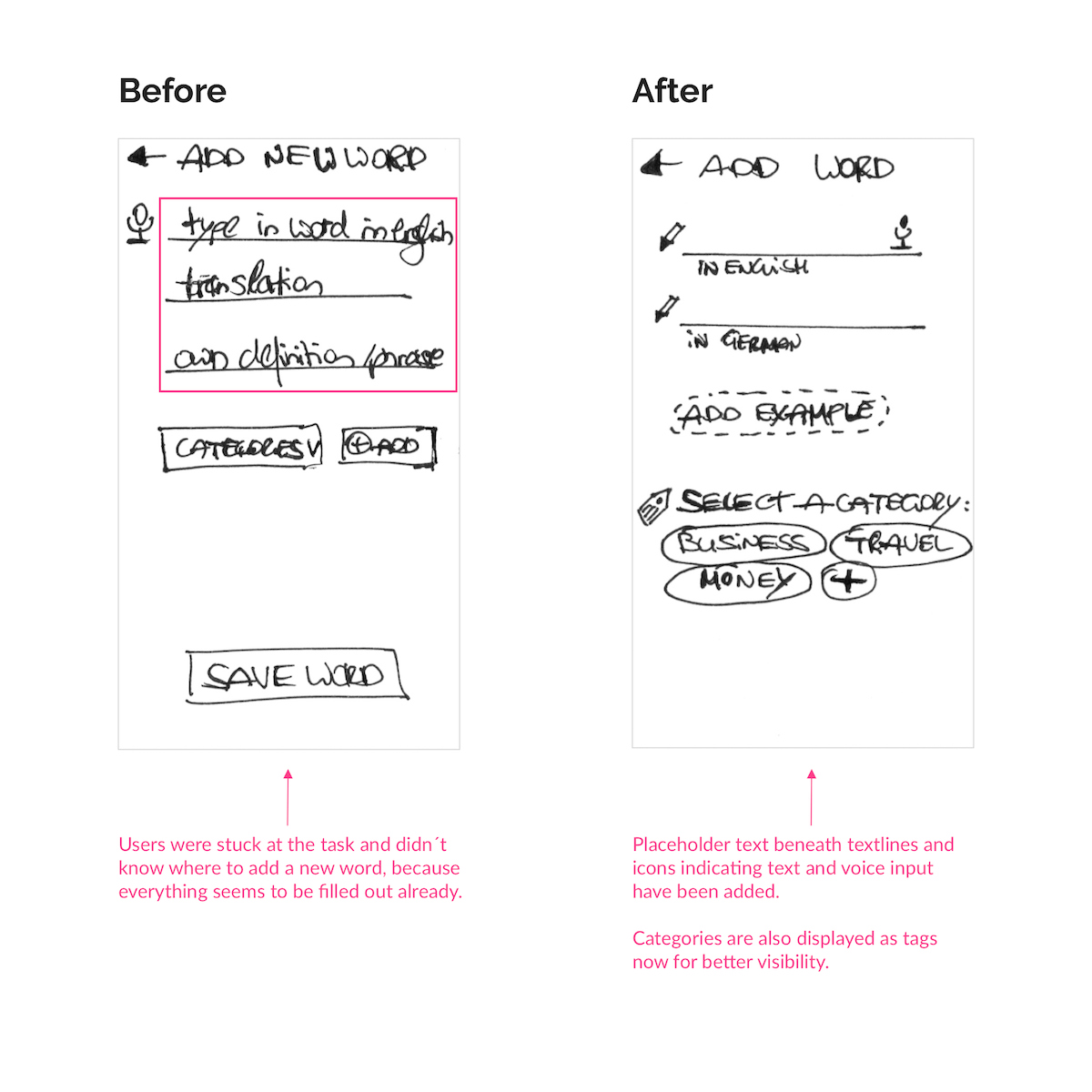
This issue turned out to be a usability catastrophe. All of the participants were stuck at the task and didn't know where to click to add the new word to the category. The main reason for that was that the placeholder text seemed like the new word was filled in already. Categories were also hard to see from the dropdown menu.
To solve this, I redesigned the screen. I added placeholder text under the text lines and added icons to make text input clear. I also redesigned the categories section. Instead of the dropdown menu, I included tags for existing categories to make them more visible and easier to choose from.
View Prototype
After implementing user testing feedback, I finalized the low-fidelity prototype using marvel. Feel free to interact with the prototype to see how it works.
Learnings
Less is more: In terms of content and options, less is sometimes more. If users are presented with too much content on the screen or too many options to choose from, they feel overwhelmed. I will keep this in mind when designing interfaces in the future.
Have visual cues for orientation: Without any visual cues, it can be easy to get lost in the task, so it's important to guide people through the interface by providing visual cues for easy orientation.
Importance of consistency: People need consistent names and labels to not get confused. If the screen says "add a word", they would also expect a button with the add a word label. I will remember this when designing buttons and screens in upcoming projects.
Expect the user's mental model to be different from your own: Solutions that work for you, might not work for the user, so it's important to keep in mind they often have a different mental model.
Test early and often: Test and fail early and often to learn from mistakes and create better user experiences.
