hero image the sill

The Sill

Project Summary

The Sill is a direct-to-consumer plant brand founded in 2012 with the mission of making people happy through plants. They ship potted plants nationwide and have brick-and-mortar stores in New York City, California, Illinois, and Maryland. Their goal is to bridge the gap between plants and people - offering products and services tailored to individual styles, lifestyles, and budgets.

Problem & Goals

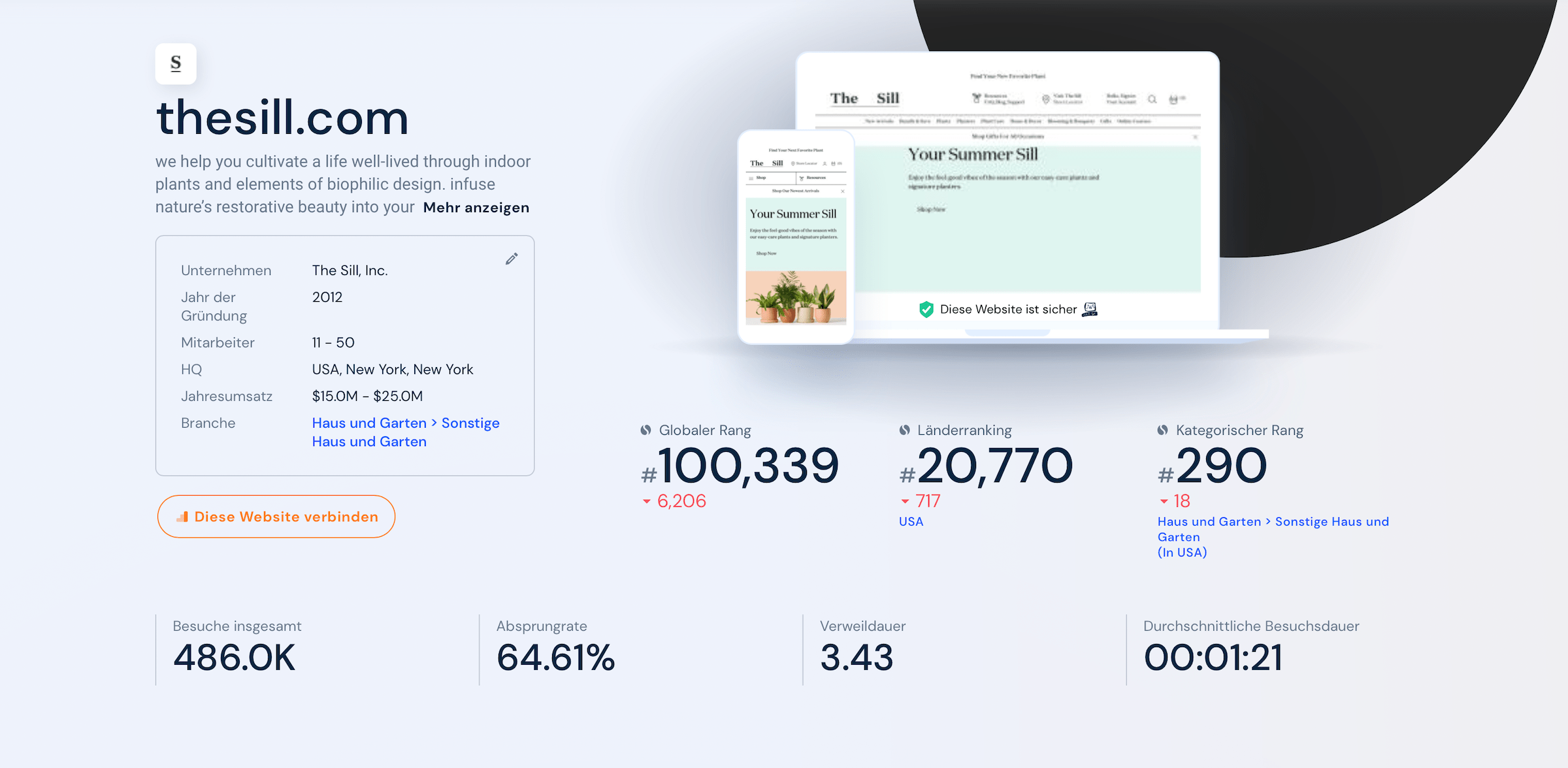
Despite The Sill's growing popularity among plant lovers, a quick web analysis revealed a 64.6% bounce rate and recurring customer dissatisfaction with product availability and intransparent shipping times. For this reason, I decided to conduct a heuristic evaluation of The Sill's web experience to analyze and solve usability issues to increase engagement.

Project Type
  • Heuristic Evaluation
Timeline
  • 5 days
Role
  • UX Designer
Responsible for
  • Web analysis
  • Customer reviews
  • Proto Personas
  • User Flows
  • Heuristic Evaluation
  • Low-Fidelity Wireframing
  • Mockups
Tools
  • Figma
  • Axure
  • Pen & Paper

Disclaimer: I am not affiliated with The Sill. The problems identified and the redesign are based solely on my observations and knowledge. Since I don't have full access to all user data that influenced their current design, this case study isn't fully comprehensive. The project was done solely for the purpose of learning and to challenge myself to evaluate and solve usability problems with an existing product.

Process & Methodology

Process

During the project I followed a three step process that helped me guide the evaluation of the Sill’s web experience from a user’s point of view.
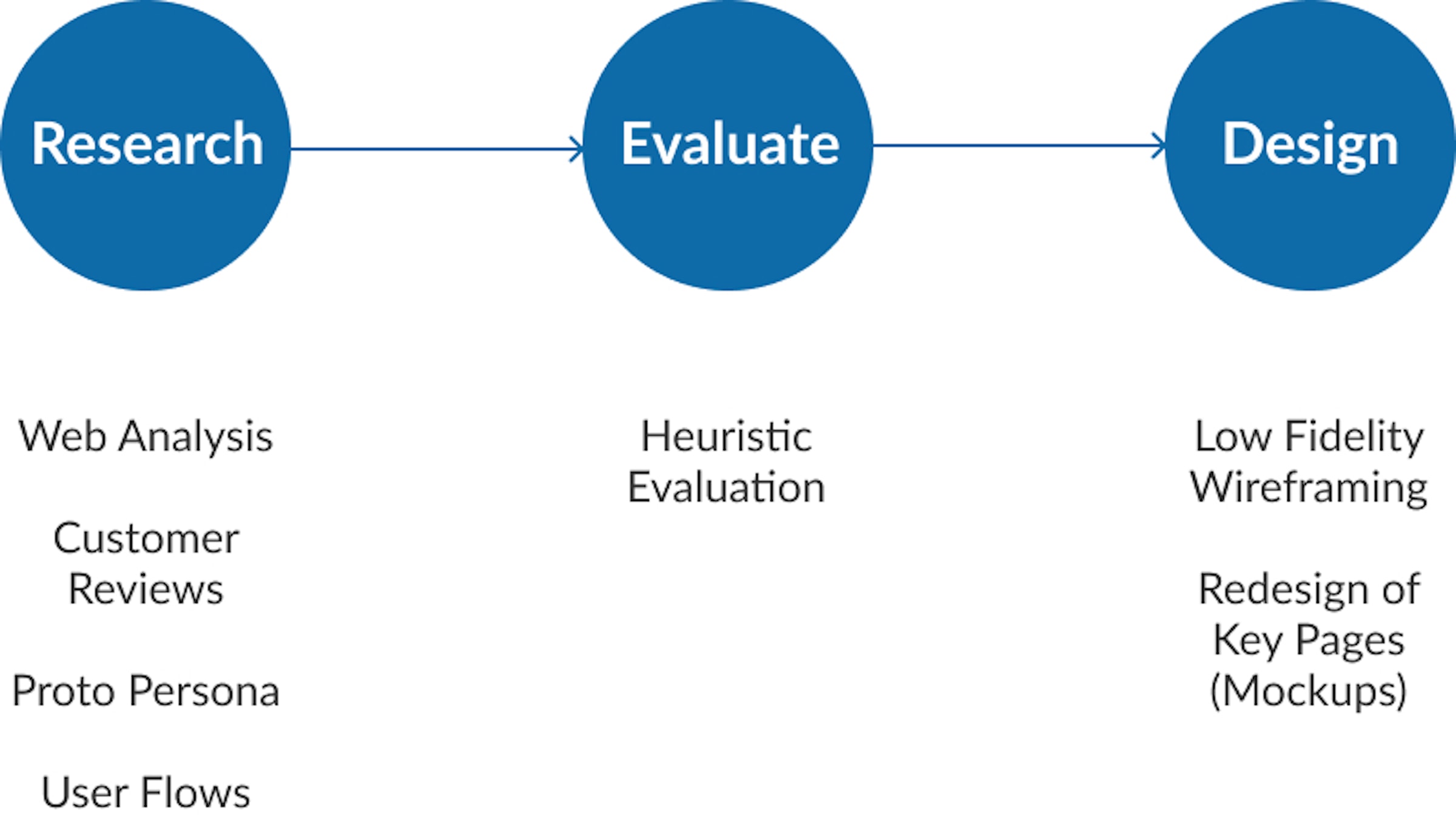
Design thinking process image

Methodology

For the evaluation I decided to use the 10 usability heuristics for user interface design by Jakob Nielsen because the are most commonly used and serve as a standard designers adhere to in order to find usability issues in web and mobile interfaces.

#1: Visibility of system status

The design should always keep users informed about what is going on, through appropriate feedback within a reasonable amount of time.

#2: Match between system and the real world

The design should speak the users' language. Use words, phrases, and concepts familiar to the user, rather than internal jargon. Follow real-world conventions, making information appear in a natural and logical order.

#3: User control and freedom

Users often perform actions by mistake. They need a clearly marked "emergency exit" to leave the unwanted action without having to go through an extended process.

#4: Consistency and standards

Users should not have to wonder whether different words, situations, or actions mean the same thing. Follow platform and industry conventions.

#5: Error prevention

Good error messages are important, but the best designs carefully prevent problems from occurring in the first place. Either eliminate error-prone conditions, or check for them and present users with a confirmation option before they commit to the action.

#6: Recognition rather than recall

Minimize the user's memory load by making elements, actions, and options visible. The user should not have to remember information from one part of the interface to another. Information required to use the design (e.g. field labels or menu items) should be visible or easily retrievable when needed.

#7: Flexibility and efficiency of use

Shortcuts — hidden from novice users — may speed up the interaction for the expert user such that the design can cater to both inexperienced and experienced users. Allow users to tailor frequent actions.

#8: Aesthetic and minimalist design

Interfaces should not contain information which is irrelevant or rarely needed. Every extra unit of information in an interface competes with the relevant units of information and diminishes their relative visibility.

#9: Help users recognize, diagnose, and recover from errors

Error messages should be expressed in plain language (no error codes), precisely indicate the problem, and constructively suggest a solution.

#10: Help and documentation

It’s best if the system doesn’t need any additional explanation. However, it may be necessary to provide documentation to help users understand how to complete their tasks.

Source: https://www.nngroup.com/articles/ten-usability-heuristics/

Research

Web analysis

I started with a research phase to get an overview of common user pain points and issues on the site by running a quick web analysis on the platform and looking at customer reviews online.

Web analysis

Customer Reviews

Customer reviews
Key Findings
  • The web analysis revealed that The Sill had a high bounce rate of 64.6% at the time of analysis, and web traffic had decreased significantly by 5% between March and April 2022.
  • Customers mostly complained about long and intransparent shipping times, which made it difficult to plan ahead when buying gifts.
  • Missing information about availability of products leads to uncertainty and frustrations when making purchases.
  • It's also difficult for users to judge the size and quality of plants based on product images alone.

Proto-Persona

Next, I used the results of the customer reviews to create proto-personas to empathize with user needs and pain points. The personas also helped me to guide the evaluation from a user's point of view.
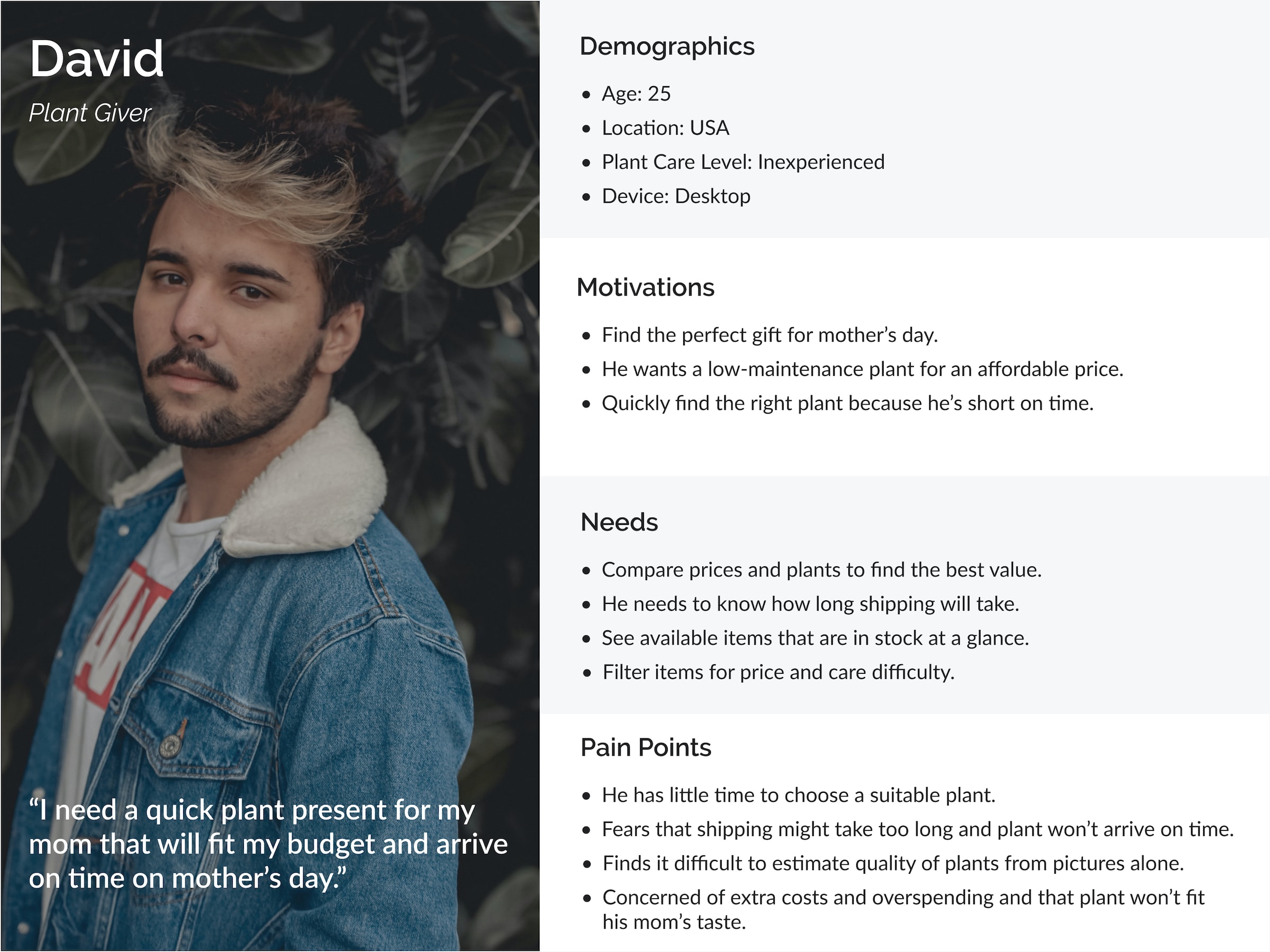
Persona Francesca

User flows

I then used the proto-personas to outline key flows that Sarah and David would have to go through to accomplish their goals on The Sill. The user flows served as a starting point for identifying key pages I wanted to focus on when evaluating the interface.

  • As a new user, David will use the web shop to find an affordable, easy-care plant for Mother's Day that fits his budget and arrives on time.
  • As an existing user, Sarah needs to customize and purchase a medium sized low-light plant to add to her growing collection.
User flow: Find an easy-care plant for mother's day
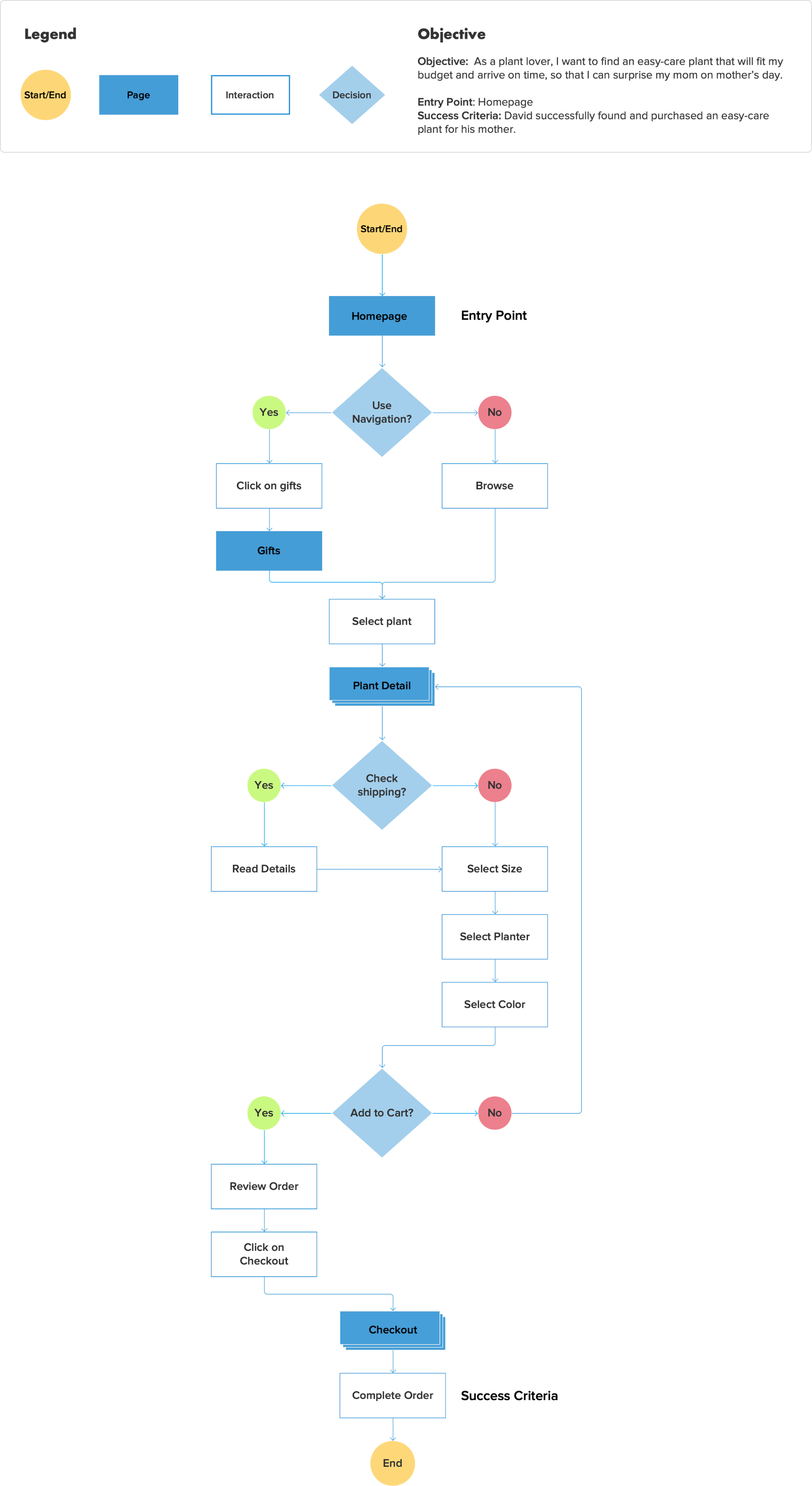
David user flow

Evaluate

Heuristic Evaluation

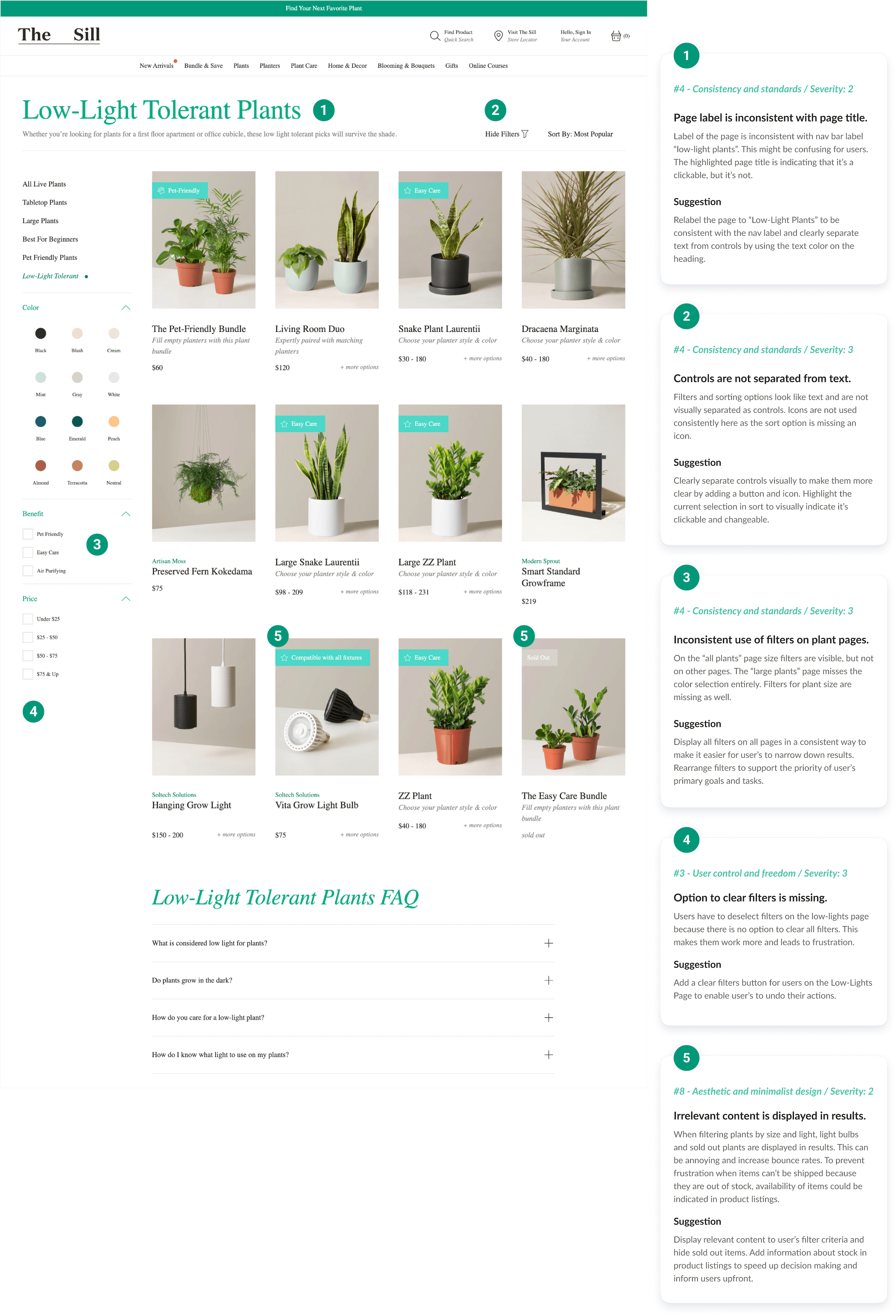
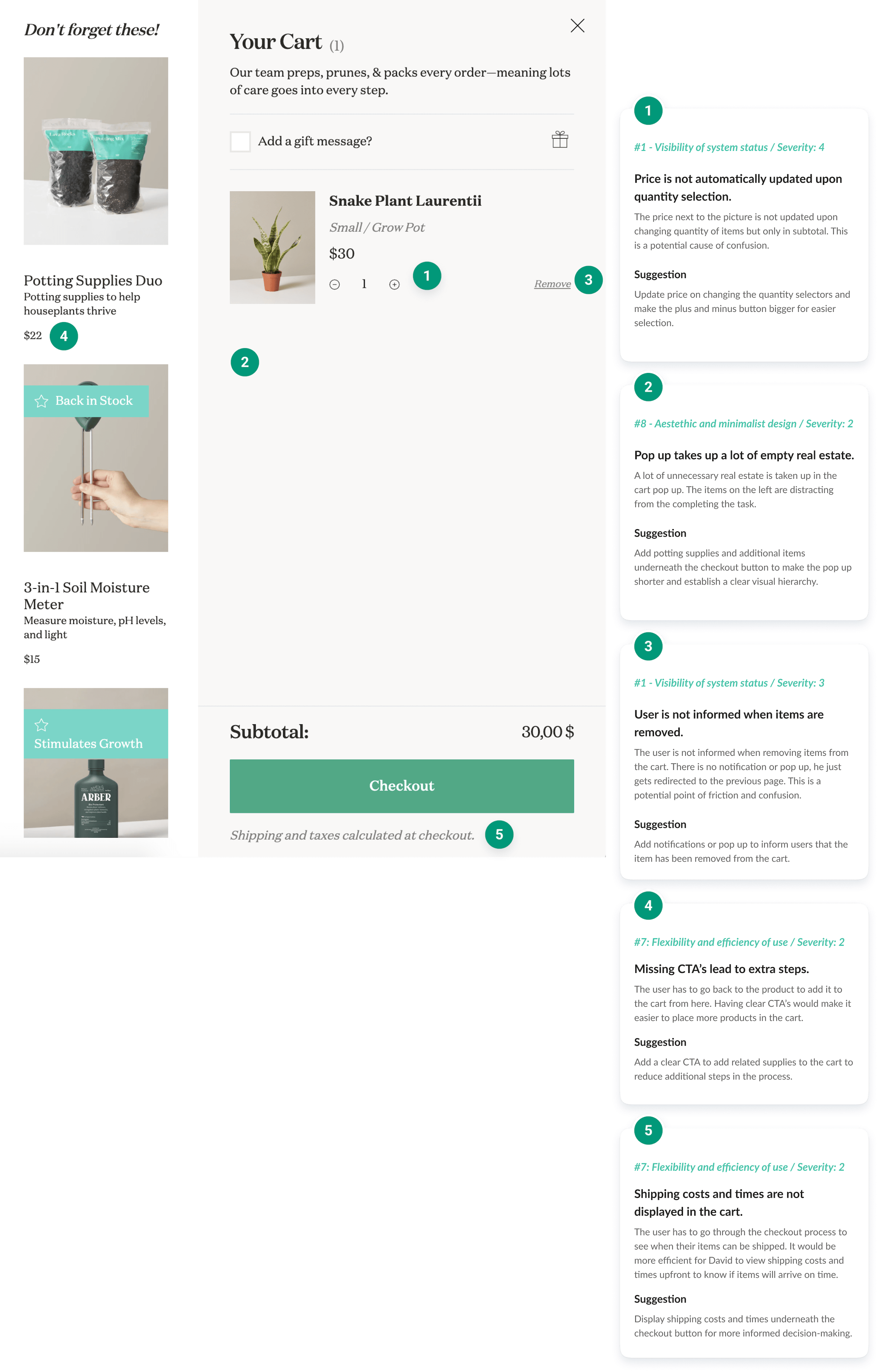
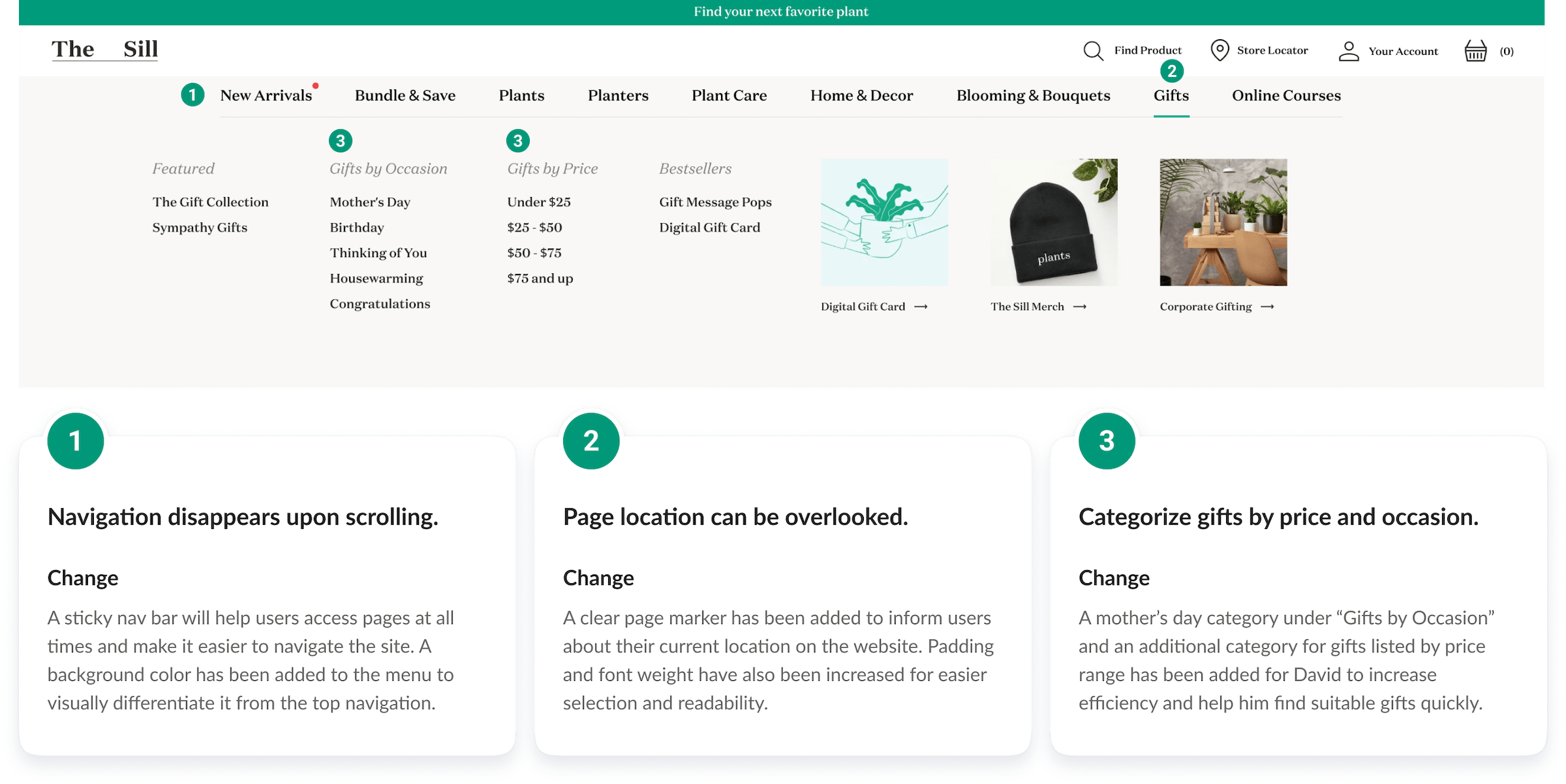
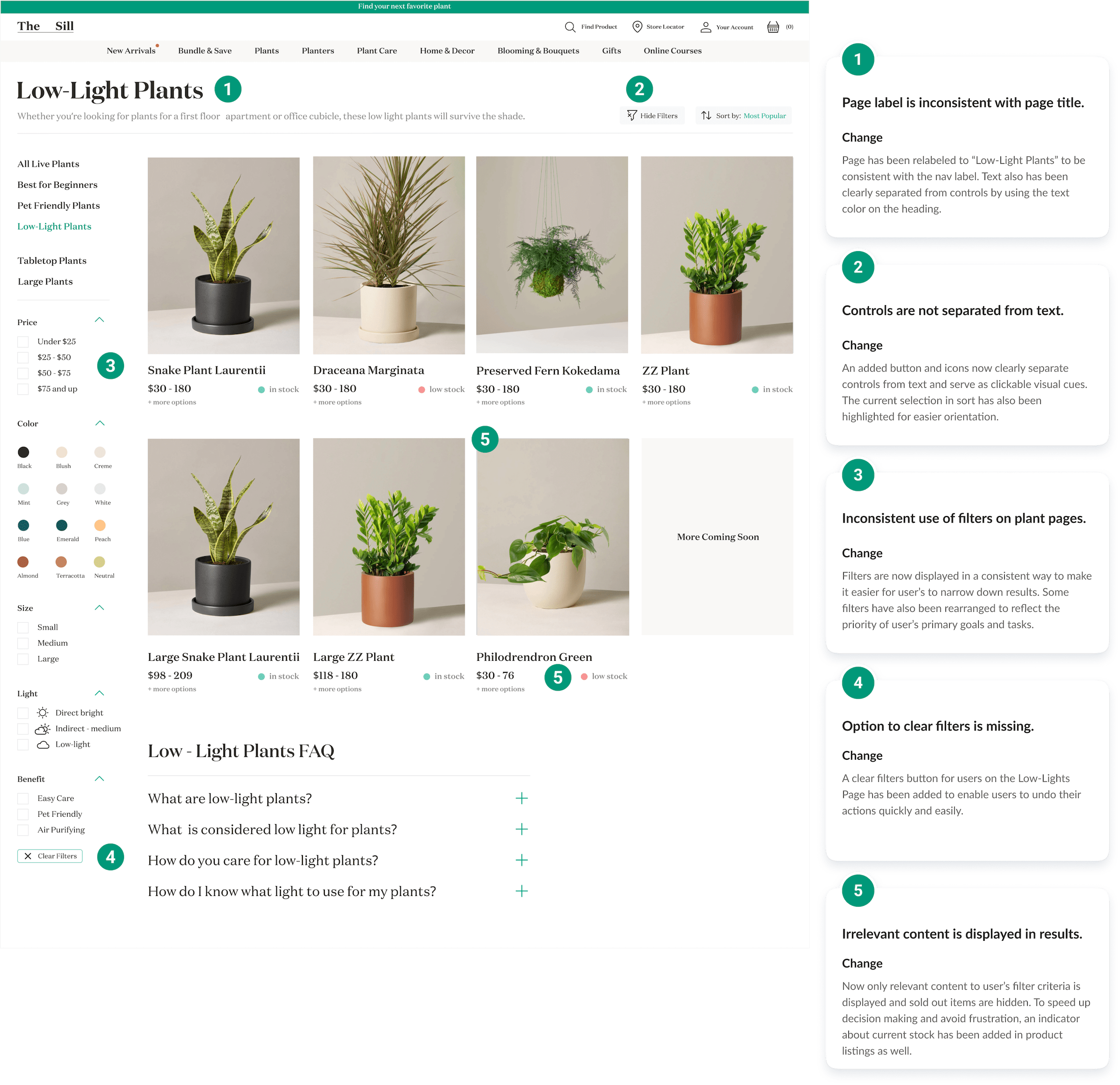
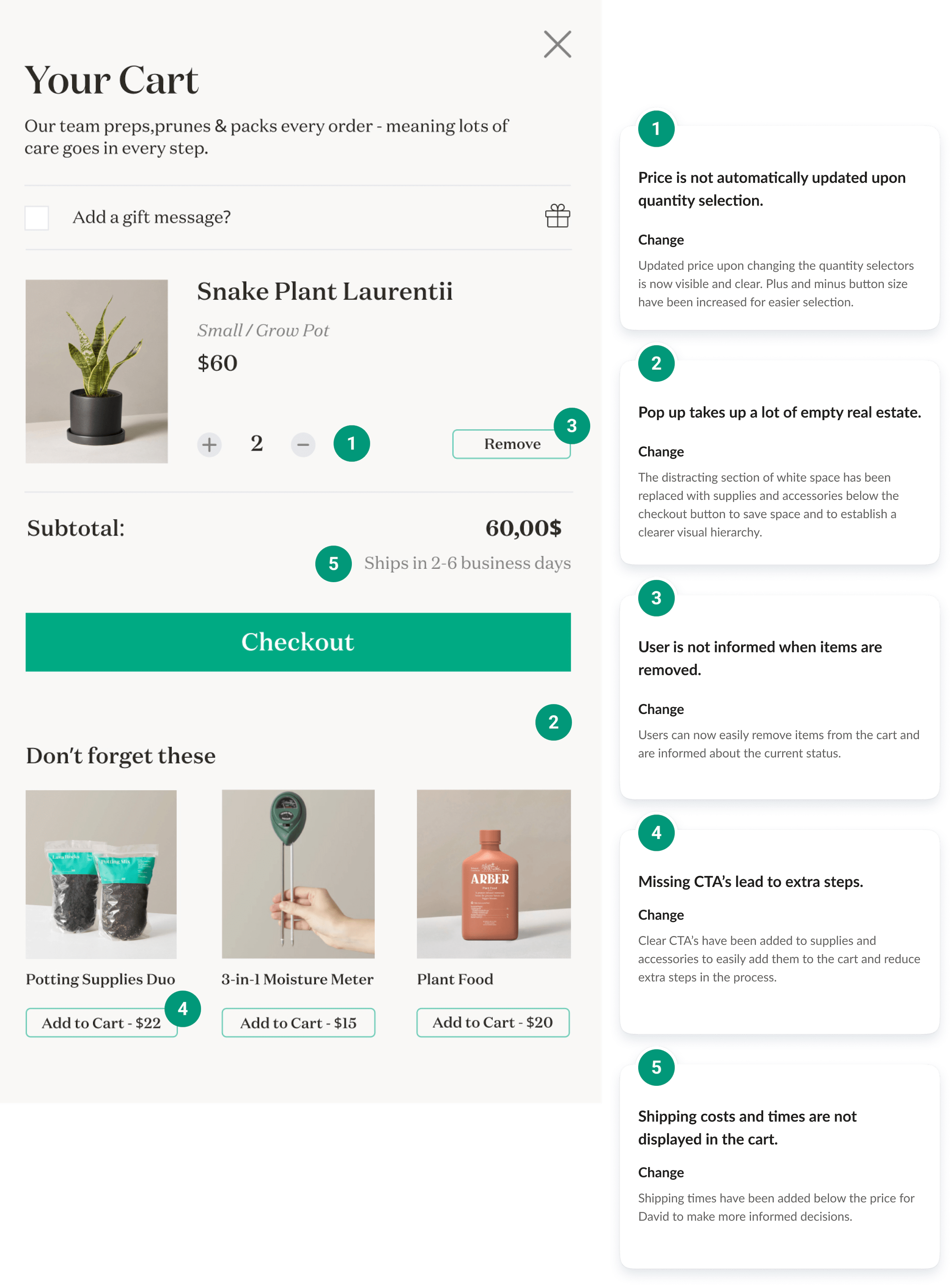
Based on the user flows, I conducted the heuristic evaluation in two steps, focusing on key pages needed to perform user tasks. First, I conducted a cognitive walkthrough and analyzed the web shop experience for user needs. In a second round, I evaluated key pages using Jakob Nielsen's 10 usability heuristics to identify any usability problems, rate their severity, and make recommendations for improvement.

Navigation
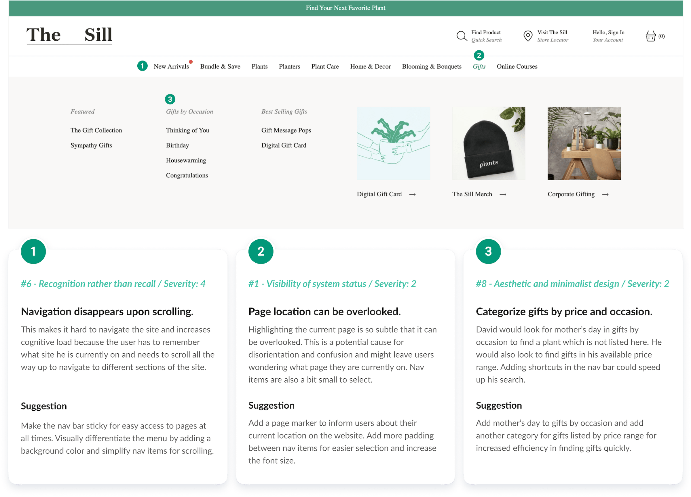
Navigation

Products

David user flow

Cart

David user flow

Design

Sketching out possible solutions

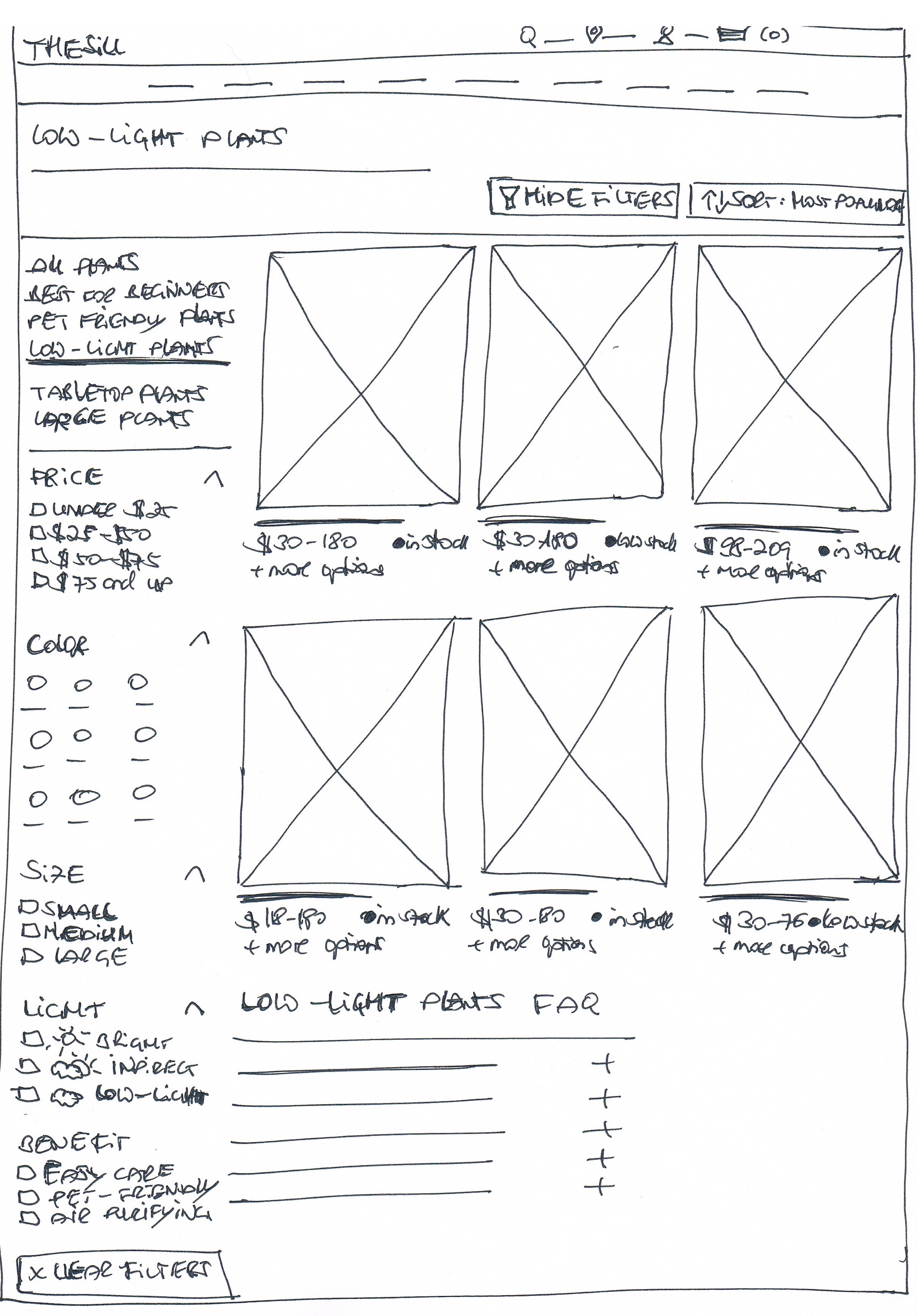
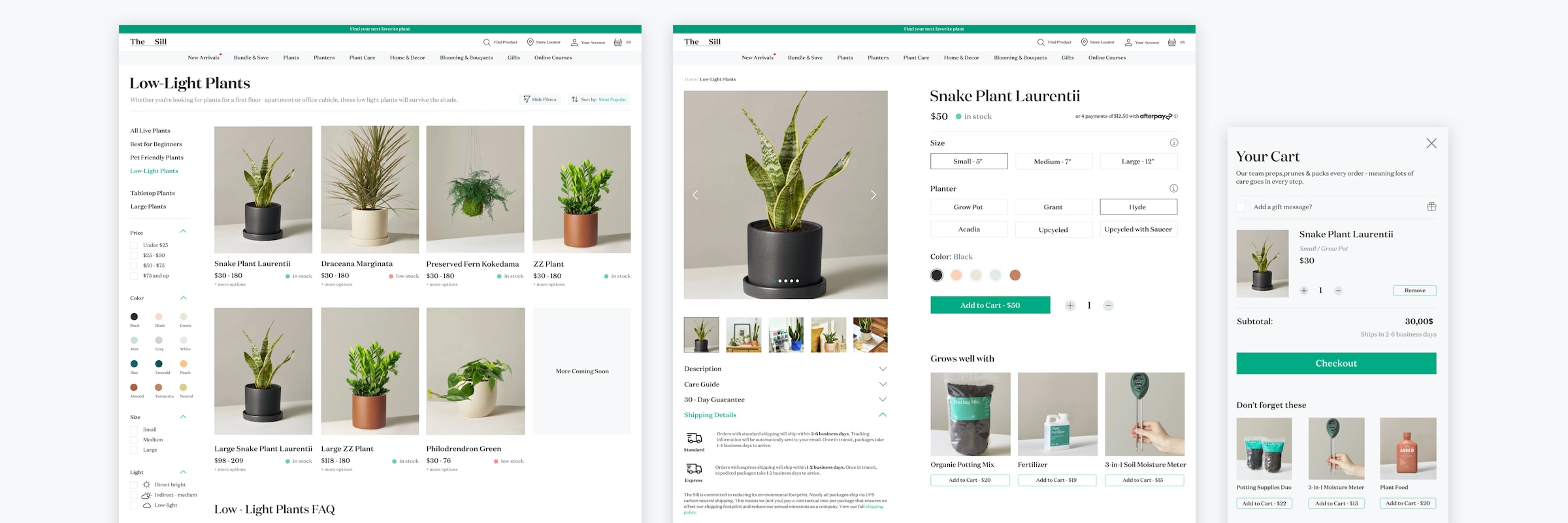
Using the user flows and proto-personas, I started creating low-fidelity wireframes on paper to find different solutions to usability problems. I then turned them into high-fidelity wireframes in Figma to redesign the navigation, the low-lights page, the product details page, and the cart.

Product Page

Low Fidelity Sketches

Navigation

Low Fidelity Sketches

Products

Low Fidelity Sketches

Cart

Low Fidelity Sketches

Next Steps

The heuristic evaluation of The Sill has been a valuable learning experience. It allowed me to get an objective view of the usability status of an existing product and use the findings to come up with solutions to usability problems that could potentially increase engagement. For optimal results, the next steps for the project include conducting usability tests with users in order to measure the effectiveness of the solution.