Design
Content-First Strategy
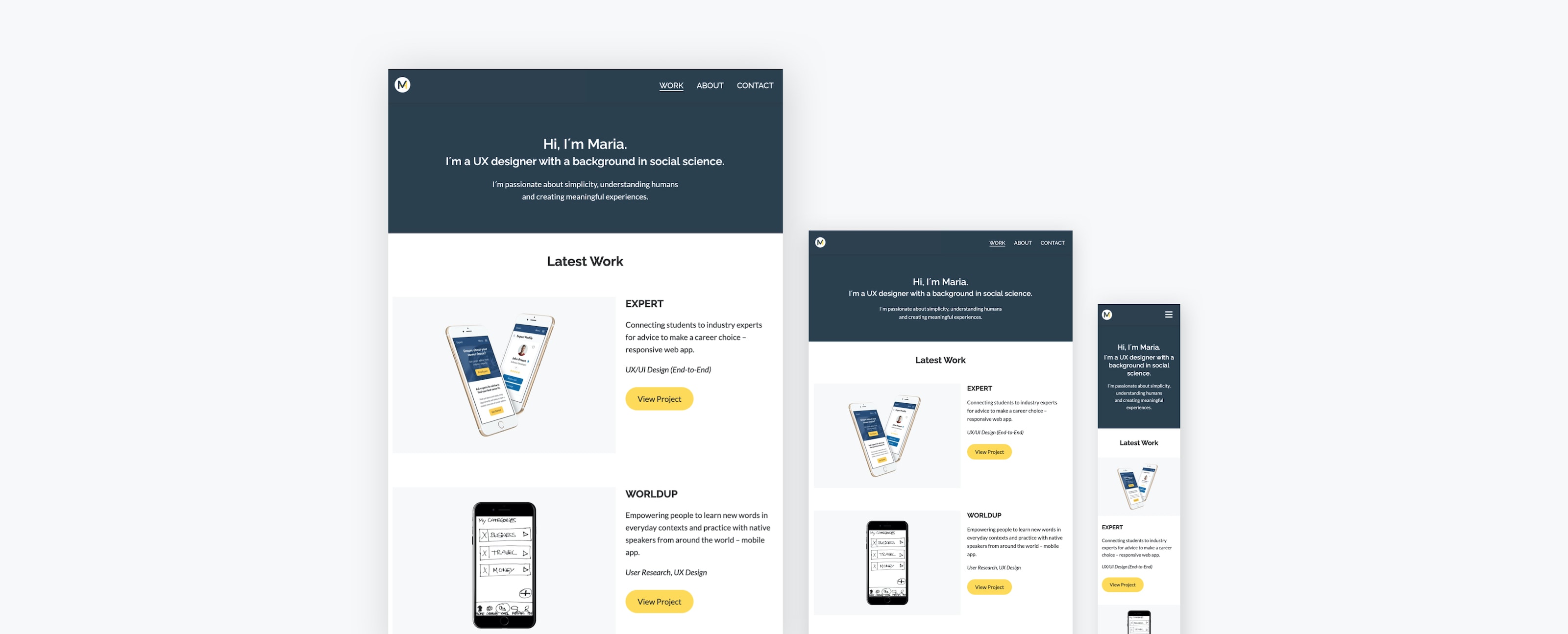
First, I started to gather assets and create the content for each portfolio page to focus on the development of the site for the rest of the course. I created optimized images for mobile and desktop with reduced file size and resolution for faster loading times on the site and optimal user experience across devices.
Defining the Visual Style
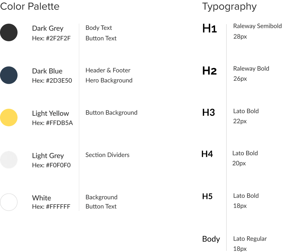
To decide on the visual style of the website, I defined the color palette, typography and created a logo to represent my brand. For a consistent look, I chose a subdued color palette of blue and yellow tones, that is easy on the eyes and creates a welcoming mood for visitors. Blue represents professionalism and yellow stands for taking risks to try new things.
For typography, I selected the google fonts Raleway and Lato, because they are easily accessible, readable, and modern. To create a logo that's simple and easily recognizable, I merged the letters of my name into one.
Development
Building the HTML Structure
After the content was prepared, I moved on to the development of the portfolio site. I started by creating an HTML structure for the header, body, and footer section for the homepage, about, and project pages. This would serve as a skeleton to hold my content.
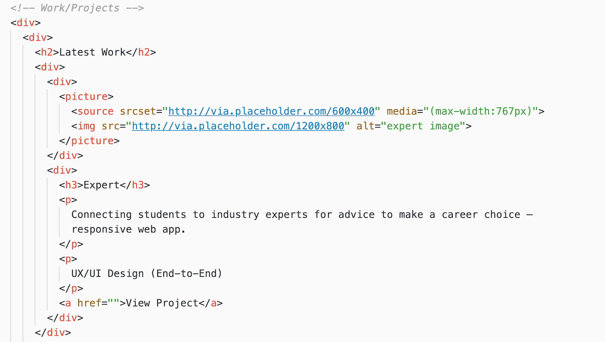
Using the wireframes from the brief as a guide, I built the main part of my HTML pages using div containers to have more control over styling and layout in CSS later. At this stage placeholder images were used, which were later replaced with real images using the picture tag, so they could be displayed at optimal size on mobile and desktop.
Work section on the homepage structured with div elements
Applying CSS Styling
With the HTML structure in place, it was time to apply some CSS styling to add a personal flair to the site. CSS stands for cascading style sheet and controls how HTML is presented in the browser.
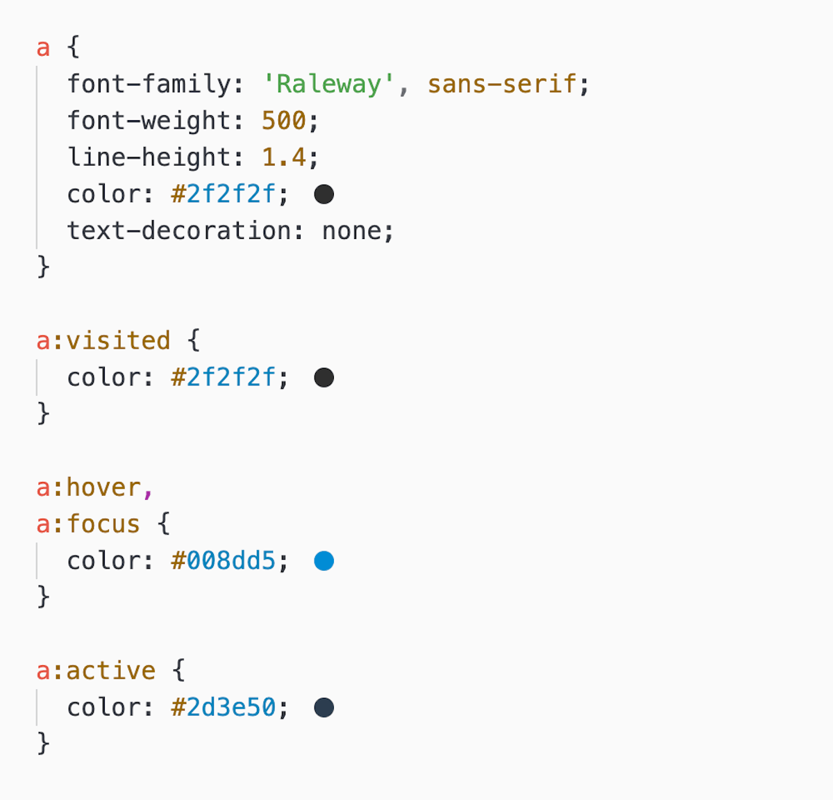
First, I embedded the google fonts I had decided on earlier and defined text styling, such as font-sizes, font-weight, line-height for h1-h5 headings, and body text. Afterwards, I also applied colors and added link styling for different states to give my website the intended look and feel.
Link styling for different states
Button Styling
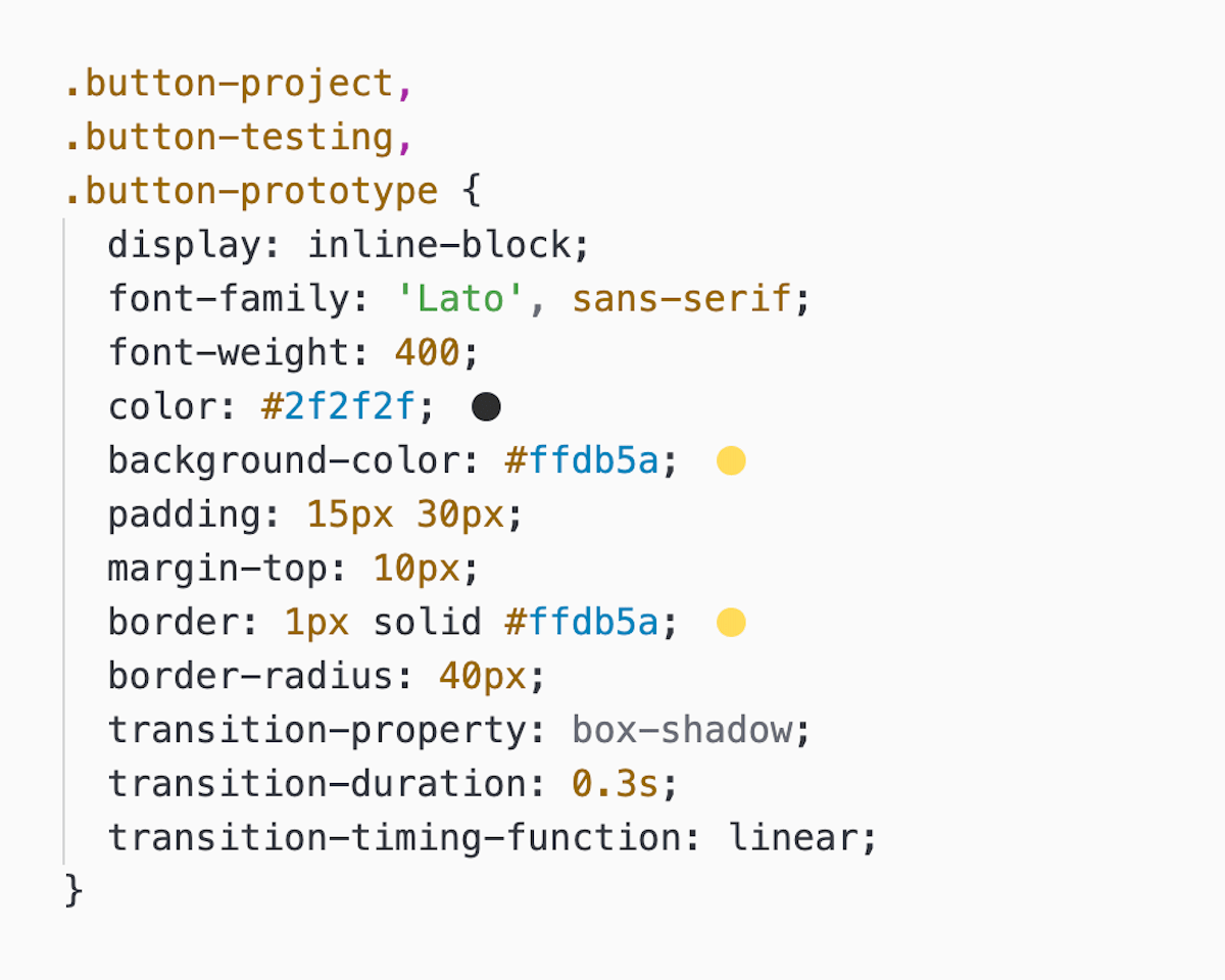
I also made use of transition effects on buttons to make them more accessible and interactive for users. CSS transition defines the animation between a start and end state. I used them to create a smooth transition for drop shadows on buttons upon hover.
Button styling with transitions
Adjusting the Layout with Media Queries
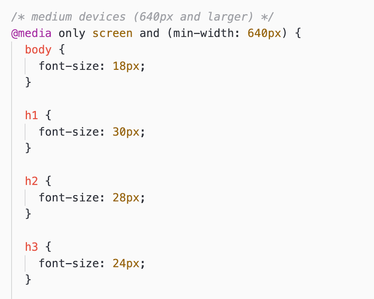
To create the layout for the homepage, about and project pages, I followed the wireframes provided in the brief. I made use of a 12-column grid and adjusted the layout for medium and larger screen sizes with media queries. Media queries allow for writing code that will only affect the layout up, to, or from a defined breakpoint. I used them to adjust the spacing between columns for larger screen sizes and to define font-sizes for h1-h5 headings for better readability on tablet and desktop.
Styling of font-sizes with media queries
To check the layout and styling for different viewports, I heavily relied on the "inspect" mode in google chrome to see the results of my changes and do some troubleshooting when the positioning of elements was off.
Adding Interactivity with JavaScript
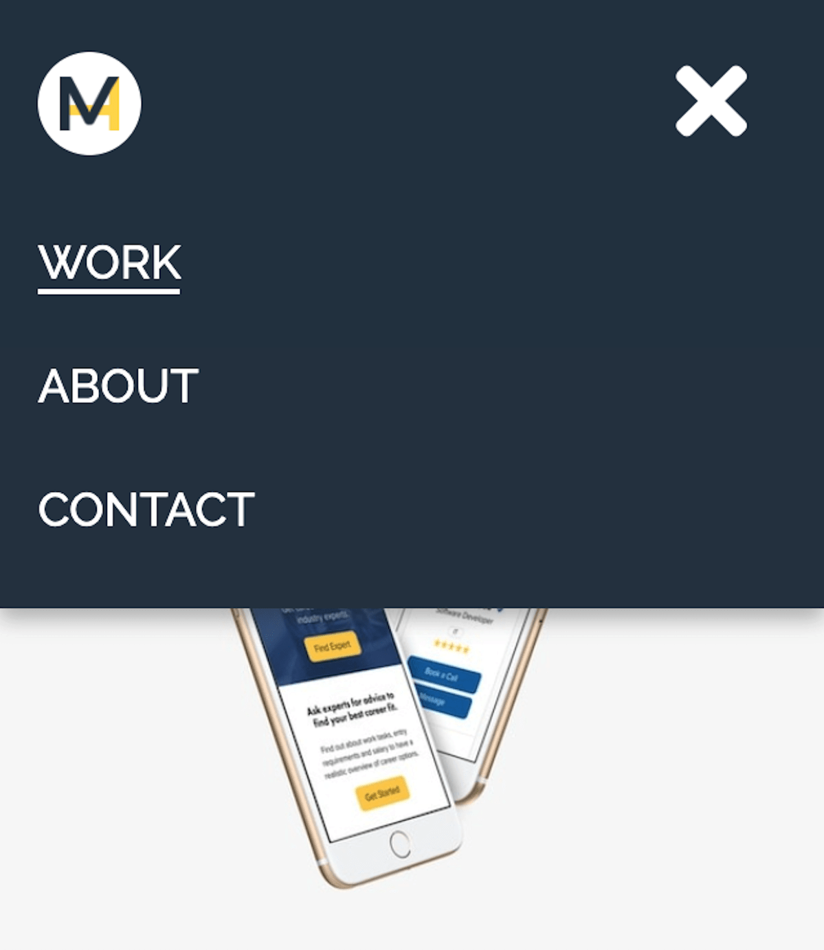
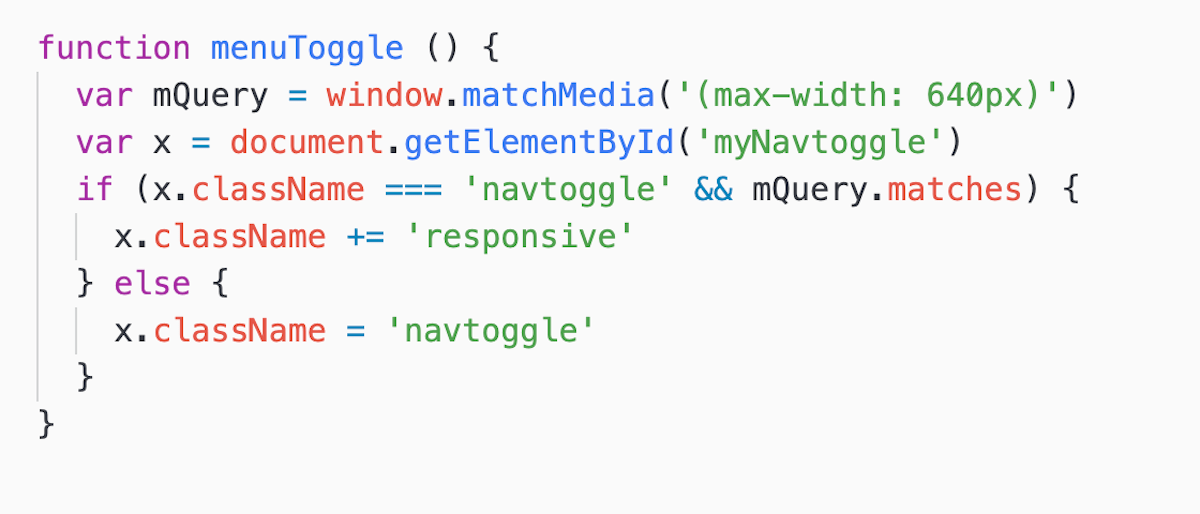
Next, I used Javascript to add some interactivity to my website by adding a mobile menu, that could be toggled on and off on click. The menu should allow users to navigate the site more easily on mobile devices. The challenge here was to keep the navigation bar for tablet and desktop and make the toggle menu only work on mobile.
During this phase, I had the issue that the menu still showed up in tablet and desktop view. After some experimentation and research on StackOverflow, I solved the issue by adding media queries to the JavaScript code.
JavaScript code to make the toggle menu work
User Testing
Now that the first iteration of the site was complete, I conducted a moderated user test with 6 participants via skype. The testing was important to find and iron out any usability issues on the site.
The main challenge here was to find suitable participants. Recruitment over Slack and Reddit took longer than expected. Due to a lack of responses from hiring managers on Reddit, I adjusted my recruitment criteria to "anyone with experience of reviewing designers' portfolios as part of a hiring process". This opened up the pool of target users and enabled me to find suitable participants for testing sessions.
Main Goals
The goal of the user testing was to find out:
- How easy is it for first-time users to complete basic tasks on the site?
- Can users find the information they're looking for easily?
- What errors occur frequently and how severe are they?
Issues were rated based on Jakob Nielsen's rating scale and ranked by severity and effort.
Key Findings
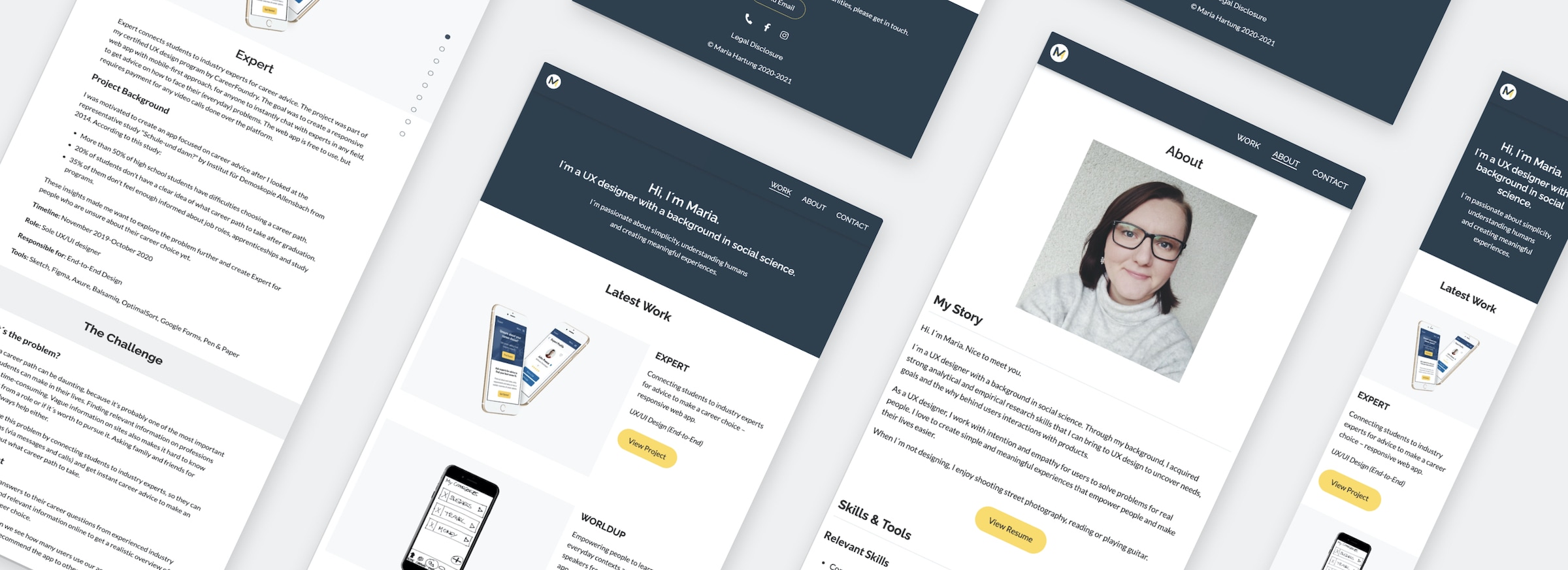
Most users found the site intuitive, simple, and easy to navigate. They could easily find my resume, learn more about projects and contact me. The only major issue encountered by all users was long scrolling on lengthy project pages with no option to navigate to different sections they were interested in.
Change
To address the issue of long scrolling on project pages, I added a jQuery plugin for a dot navigation. This allows users to navigate to different parts of the case study more easily.
Reflection
Solution
My main goal was to build a responsive website that is easy to customize to present my work to potential employers. Through learning HTML, CSS, and JavaScript, I could accomplish this and create a portfolio website with simple aesthetics that is easy to navigate and offers users quick access to projects, my resume, and the contact section.
What went well
Working on this project has been a rewarding experience. I enjoyed seeing the website come to life with every bit of code I added. During the process of experimentation, user testing, and iterations, I learned how solutions can be implemented with HTML, CSS, and JavaScript. I also gained a better understanding of working with grids. This will help me to consider technical feasibility when making design decisions and collaborating with developers in the future.
What didn't go well
I fell a bit behind schedule due to the recruitment of user testing participants. When working on other projects in the future, I will plan more time for recruitment and have a flexible recruitment criteria to start.
What could be improved
As the site will be a work in progress, I will continue to make changes over time. I plan to add a custom domain for better findability and add more projects to the site. As the number of projects will increase, I also want to experiment with a different layout for the work section on the homepage.
For an in-depth view of the latest changes made to the site, check out the GitHub repository here:
