
Expert
Problem
Browsing different websites to find relevant information in order to make a career choice can be time-consuming and frustrating when you can’t find answers to your career questions. Vague information in complex language also makes it hard to get a realistic overview of roles and know what to expect.
To solve this problem, I created the responsive web app Expert. It connects students to industry experts in tech via messaging and video calling for tailored career advice to help them make an informed career choice. The web app should be free to use but requires payment for any video calls done over the platform.
- Concept
- Nov 2019 -
Oct 2020
- UX/UI Designer
- Competitive Analysis
- User Research
- Information Architecture
- Wireframing & Prototyping
- Usability Testing
- UI Design
- Sketch
- Figma
- Axure
- Balsamiq
- OptimalSort
- Pen & Paper
The Challenge
Background
According to the representative study "Schule-und dann?" by Institut für Demoskopie Allensbach from 2014:
- More than 50% of high school students have difficulties choosing a career path.
- 20% of students don't have a clear idea of what career path to take after graduation.
- 35% of them don't feel informed enough about job roles, apprenticeships, or study programs.
Choosing a career path can be daunting indeed because it's one of the most important decisions students can make in their lives. Finding relevant information on professions online is time-consuming. Vague information on sites also makes it hard to know what to expect from a role or if it's worth pursuing it. After validating the problem with real users during the project, I was able to come up with a problem statement.
Problem Statement
Students need a way to get answers to their career questions from experienced industry experts because they can't find relevant information online to get a realistic overview of job roles in order to make a career choice.
We will know this to be true when we see how many users use our app to get career advice from industry experts and recommend the app to others.
Process
Design Thinking
To solve the problem, I applied the design thinking methodology during the project. It was used to understand the user, define the problem, and create a user-centered solution in six phases.

Understand
Analyzing the Competition
To understand the problem space, I first analyzed two competing products and compiled the results into SWOT profiles. Due to a lack of direct competitors in the european market, I chose the indian app edggi and coachilla for the analysis because they had a similar feature set and aimed at solving the same problem.
After the evaluation I could not only reveal their strengths and weaknesses but also find opportunities for Expert to stand out in the market. To differentiate itself, Expert needed to have clear labeling of navigation items, autocomplete and autosuggestions for search, and an original design.

Observe
Survey
Next, I carried out user research to understand the user. I ran an online survey with 16 participants to identify the most important target audience, find pain points in tools they use, and prioritize features that would be of value to them. The survey was distributed on Facebook, Reddit, Slack, and thestudentroom.co.uk for a wider reach.
Although the survey stayed active for a week, the number of responses could have been higher for more reliable results. Nonetheless, I could still gather valuable insights that helped define the further course of the project.

Survey Results
Survey findings showed that our main target audience is between 25-34 years old and is primarily college students. They mostly struggle to filter and find relevant information on careers in their current field of study. To make a career choice, booking calls with experts, searching for career experts, and viewing questions and answers in forums would be most helpful. However, findings also revealed a hesitation to use an app like Expert: 25% wouldn’t use it at all; 31.3% were unsure about it.
User Interviews
As a result of survey findings, I narrowed down the primary user group to college students to target them for 5 interviews for a better understanding of their needs and goals. To recruit the right participants, I made use of guerilla research. I screened and recruited students on a local university campus and conducted the interviews on location.
Interviews were aimed at finding out:
- What are users' general experiences with searching for career advice online?
- How do they go about it?
- What do they need to know to trust experts and contact them for advice?
- In what case would they rather call or message experts?
Affinity Mapping
After the transcription of interviews, I used affinity mapping to make sense of my data and find common patterns in users' responses. With this technique similar responses are grouped into clusters. These were later used to generate insights.

Key Findings

POV
Empathizing with the User
Next, I used my research findings to create personas to empathize with user’s needs, goals, and frustrations. As a reference throughout the project, they helped me to stay on track and make design decisions with end-users in mind.


Ideate
Mapping Out the Journey
Personas were used next to inform the creation of user journey maps to visualize the process Tim and Isabel needed to go through to accomplish their goals in Expert.
Tim’s Journey: Tim has a specific job role in mind and needs to weigh benefits and costs to get a realistic overview of the role. He will use Expert to search for an IT expert, check reviews on him, and book a call for inside advice to make his decision.
Isabel’s Journey: Isabel wants to decide on her best job fit. She will use Expert to browse experts, read their about me and professional experience, and message the expert for advice on what profession might fit her best.


Based on journey maps, key features for Expert were roughly decided:
- Sign Up
- Search for an expert
- Send a message to an expert
- Book a call with an expert
User Flows
Using the journey maps and personas as a guide, I created user flows to understand the specific tasks Tim and Isabel would need to do and the pages needed to complete them in the app.
User Flow for finding an expert

Information Architecture
With the user flows and journey maps in hand, I built the first version of a sitemap. To validate it, I conducted an open card sort with 6 participants to find out how users would organize information that feels logical to them.

Card Sort Results
Most groupings in the initial sitemap were intuitive to participants. Some pages were labeled differently, such as FAQ and Upgrade. Participants also grouped two different types of experts (career and IT experts) into one category instead of creating two separate ones.
Results led to a revision of the sitemap with the following changes:
- Remove expert categories and make two types of experts searchable on one page.
- Relabel FAQ to Help and Upgrade to Payment to reflect user's mental model.
- Link video calls to expert profile.

Prototype
Sketching out possible solutions
Using the sitemap, user flows, and personas, I started creating low-to high- fidelity wireframes for key features by rapidly prototyping different solutions. At first, I created rough low-fidelity sketches on paper, which were later turned into mid-and high-fidelity wireframes and prototypes using Sketch and Figma. At the end of this phase, I had a high-fidelity prototype that was ready to be tested with real users.

Low-fidelity wireframes
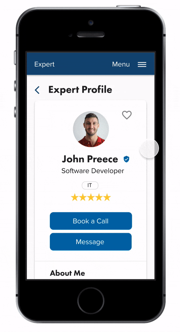
Findings from my research gave me a good idea of what users would expect on an expert profile. To offer Tim and Isabel the simplest way possible to contact experts, I included two buttons on the expert's profile to either message experts directly or to book calls with them.
For the expert pages, the initial idea was to lay out expert cards horizontally, including the expert's name, a related tag, a preview of his about me, and a view profile button, to save space and display more cards on the page. Through feedback, I later realized the cards were too small to account for longer expert names and multiple tags. So I changed the layout of the cards in later iterations to stretch them out vertically.


Test
Usability Testing
To validate my solution, I conducted moderated remote usability tests with 6 participants via Skype. The goal was to assess learnability and errors for first-time users.
- Do users understand the web app and its value?
- How easy can they complete Expert's basic functions for the first time?
- What errors do occur frequently and how severe are they?
After the tests, I used affinity mapping again to organize my findings and prioritize issues to be fixed. Errors were measured by using Jakob Nielsen’s rating scale. I also measured satisfaction with the single-ease-question by asking users to rate the difficulty of tasks at the end of the test.
Test Results
Users could complete 3 out of 4 tasks quickly and easily. The major area of confusion was task 2 (search for expert) and the lack of transparency for costs of video calls.
Issue 1: Irrelevant Search Terms (Severity: 2)
5/6 participants would have directly searched for a software developer, instead of picking an IT expert from the autosuggestions. As a result, I replaced irrelevant search terms with the job roles of experts and included software developers. I also changed the helper text in the search bar on experts' page to "enter job roles" instead of "enter field of work", which was a bit ambiguous.

Issue 2: Check Plans Button (Severity: 3)
3/6 users were frustrated to find the “check plans” button didn’t work on the book a call modal, which informs them about the paid feature. To solve this, I created a new payment page for users to feel more informed about the costs of calls. It also includes a FAQ section that answers the most common questions regarding how subscriptions and plans work.

Visual Design
Bringing Expert to Life
After having fixed flaws in the prototype through usability testing feedback, it was time to bring Expert to life with visuals. To do so, I used gestalt principles and color psychology to refine the visual design for Expert.
Color Choice
As Expert is career-related, I wanted to keep the design minimal, professional, and visually appealing at the same time. To evoke emotions of hope and optimism in users who are unsure about their career paths, I chose a color palette with blue and yellow tones. While the yellow-orange color stands for the optimism of users to make a career choice, the blue tones represent professionalism, trust, and expertise of experts.
Next, I created a design system to ensure consistency across our brand. Finally, the design was iterated based on peer feedback and accessibility guidelines.


View Prototype
After having implemented user testing feedback and the visual design, I finalized the prototype using Figma. Feel free to interact with the prototype to see how it works.
Final Solution
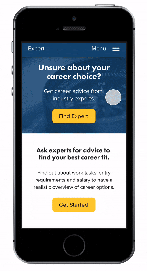
Find experienced career and industry experts in tech.
Instead of spending a lot of time browsing websites, the web app gives users instant access to experienced career and industry experts in tech they can reach out to for individual career advice. Users can easily sign up via email and search for experts related to the professions they're interested in. Career experts provide guidance for users who don't have a clear idea about their career paths yet. Industry experts can answer specific questions on professions users seek advice in.
Send free messages and get instant career advice.
Users can get in touch with verified experts and send them free messages with their career questions to get relevant information they can't find online, such as on work tasks, entry requirements, salary, and more. Users can also check the experts' about me, professional experience, and reviews of others to estimate if the expert is trustworthy before they contact them for advice.

Book paid calls for inside information to get a realistic overview of job roles.
Users can book video call sessions with experts for in-depth advice to get inside information on roles they have in mind to get a realistic overview of professions and make the right career choice. To do so, they can upgrade to affordable monthly plans with different career coaching options and a certain quota of minutes for video calls.
Learnings
Through multiple rounds of iterations and trial-and-error on user flows, journey maps, and wireframes, I learned to be open to feedback and embrace changes to ultimately improve the product for users.
I also learned to resist the temptation to add a lot of features and stay focused on the core ones that would be valuable to users. As Expert is an MVP, new features will be added and validated in upcoming iterations, such as a payment flow for PayPal, search filters, and the option to leave reviews on experts.
Finally, I learned that the quality of your research depends on the quality of your questions. In hindsight, I would focus on user tasks more in interviews and test mid-fidelity prototypes before moving on to high-fidelity ones.